
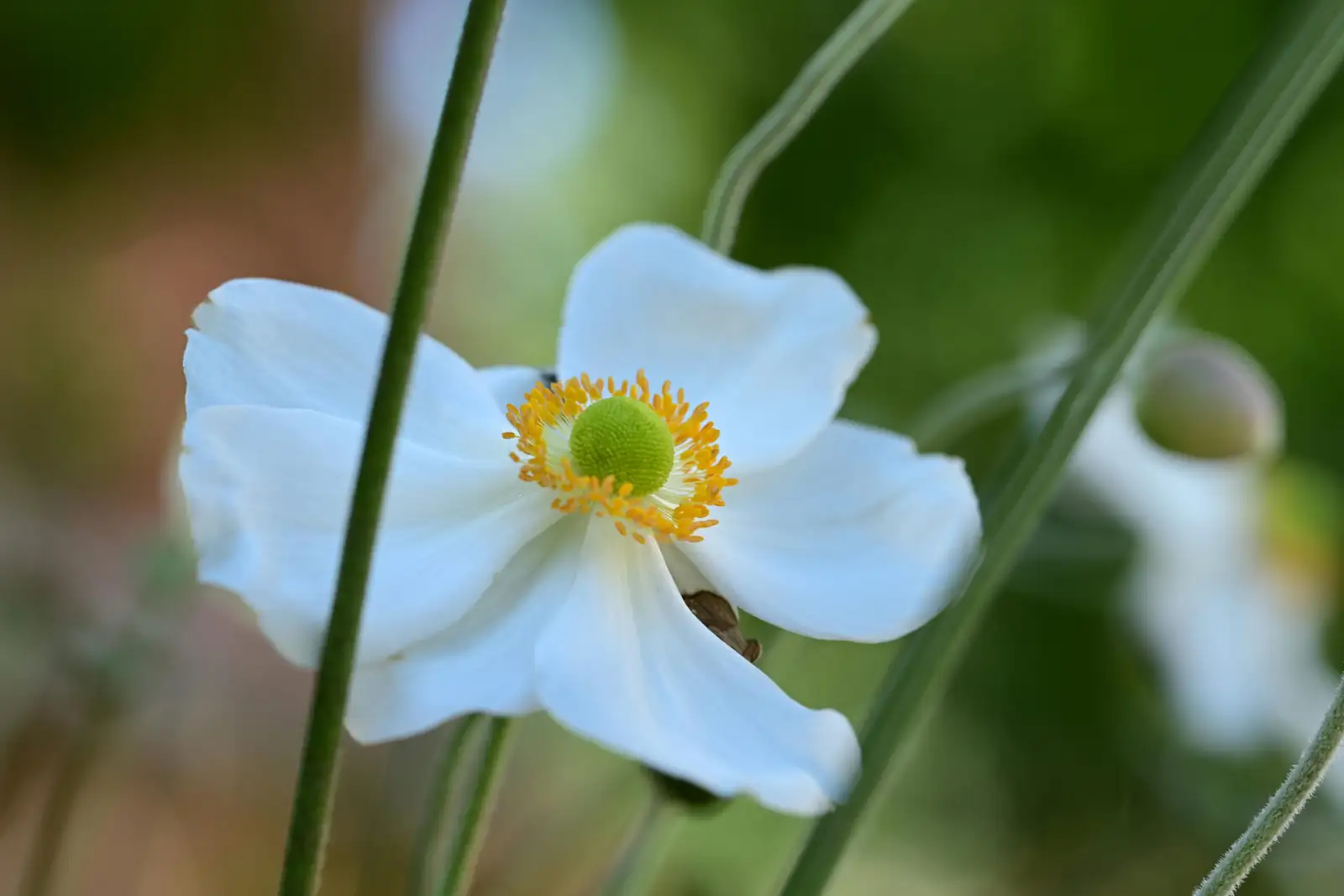
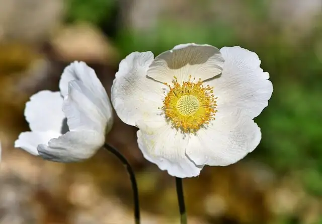
If you love flowers that behave like little spotlights—popping with graphic centers and paper-fine petals—Poppy Anemone (Anemone coronaria) is your muse. Born on Mediterranean coasts and nicknamed windflower, it’s a cool-season star with red, blue, purple, pink, and white blooms that feel both modern and poetic. Below, find design-forward ways to make those colors sing—through vase silhouettes, lighting temperatures, and tactile surfaces—whether you’re styling an entryway, setting a dinner table, or planning a spring event.
Meet the bloom: what makes anemones so photogenic
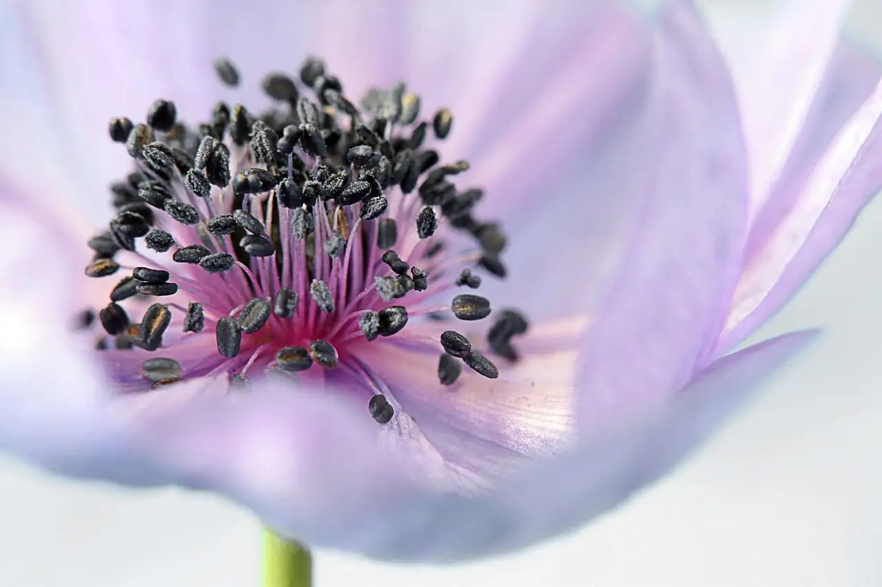
- Color range: red, pink, purple, blue, and white—often with dramatic dark centers that add instant contrast.
- Texture: petals look like fine tissue or silk charmeuse; foliage is fresh green and finely divided.
- Season and behavior: a spring-flowering, tuberous plant that loves bright light and cool temperatures; it naturally rests in summer heat (and sometimes during very cold winters).
- Cut-flower savvy: long-lasting when cut at the “first-open” stage (petals just lifting from the center), kept cool, and protected from ethylene. Keep arrangements away from ripening fruit and don’t mix anemones in the same vase with daffodils (their sap softens anemone stems).
Color stories that command attention
Think of anemone colors as your interior paint swatches—each behaves differently under light and against surfaces.
- Red: graphic and bold. Loves high-contrast backdrops (matte black, chalky white, deep walnut). Under warm light (2700–3000K), reds look lush and velvety.
- Blue: cool and clarifying. Glows against pale stone, galvanized metal, or smoked glass. Thrives under neutral daylight (4000–5000K).
- Purple: moody-modern. Pair with plum or aubergine linens, oxidized bronze, or charcoal plaster. Dimmer, directional light adds drama.
- Pink: playful to refined. Blush reads ethereal in clear glass on marble; brighter pinks pop against travertine, cane, and light oak.
- White (with dark centers): crisp, editorial, and endlessly versatile. Let them hover over mirror or lacquer for an instant gallery vibe.
Vase shapes that make petals read like design objects
- Bud vases (gloss lacquer or matte stoneware): perfect for color clustering in entryways; scatter 5–9 single stems in one hue for a strong, graphic statement.
- Low, wide compotes/footed bowls: best for dining tables—low profile encourages conversation and spreads blooms like a cloud.
- Cylinders and column vases (clear or smoked glass): amplify the stems’ elegant lines; ideal for blue and purple palettes.
- Ikebana-style with a pin frog (kenzan) in shallow bowls: one to five stems, strong negative space—elevates white or deep-toned blooms into sculpture.
- Amphora or urn silhouettes (plaster, ceramic, or patinated metal): great for entry consoles or event pedestals when you want vertical drama with easy viewing from afar.
Light it like you mean it
Anemone color is extraordinarily responsive to light temperature and direction.
- Warm, intimate dining (2700–3000K): flattery for reds and pinks; purples skew richer; whites turn candle-cream.
- Gallery-clear moods (3500–4000K): a balanced baseline that keeps all hues honest without looking cold.
- Daylight-bright (4500–5000K): perfect for blues and whites; crisp edges, editorial contrast.
- Directional techniques:
- Side-light a compote to create petal shadow-play.
- Uplight an entry urn to make those dark centers gleam like ink.
- For events, mix dimmable pin spots with candle clusters to give whites and pastels dimension.
Tip: Keep arrangements out of direct blasts from heating vents or hot sun; cool rooms extend vase life and preserve petal structure.
Surfaces and textures that make colors sing
- Marble and terrazzo: cool the heat of red and pink; chic with white.
- Raw oak, cane, rattan: warm up white and blue; creates a spring-fresh, coastal-modern look.
- Black lacquer or espresso wood: turns white anemones into graphic icons; makes purple feel luxe.
- Plaster, limewash, or concrete: the chalky backdrop amplifies petal translucency—especially blue and pink.
- Linens: stonewashed neutrals let color lead; aubergine, blush, or ink napkins echo purple, pink, or blue palettes without overwhelming.
Entryways: first impressions, zero effort drama
- Red on mirror: line a console with a tight row of matte-black bud vases, each holding a single red anemone at slightly different heights. The mirror doubles the impact; the dark centers read like exclamation points.
- Blue minimalism: three smoked-glass cylinders (short, medium, tall) with mono-blue stems—place on travertine. Add a low uplight to graze the petals.
- White “windflower” vignette: a shallow plaster bowl with a pin frog, 5–7 white stems arcing in different directions. Negative space = movement; place against a textured wall.
Pro move: Keep entry arrangements away from fruit bowls (ethylene shortens anemone life) and outside drafts.
Dining tables: low, lush, and conversation-friendly
- Monochrome compote: all-white with a whisper of soft greenery. Use a footed bowl, grid the opening with floral tape or a pin frog, and let centers hover just above rim height.
- Color-block runner: a serpentine of bud vases down the center—red cluster, then pink, then purple, then blue, then white—like painterly swatches. Anchor with neutral linens.
- Purple nocturne: low charcoal ceramic vessel, deep purples with just three whites to spark contrast. Add warm candlelight so purples glow, not flatten.
Avoid tall, dense vases that obscure sightlines, and skip scented candles that compete with the flowers’ fresh character.
Spring events: editorial statements that feel effortless
- Pedestal moments: oversized urns with loose arcs of white and blue anemones; let a few longer stems “drift” for windblown movement. Side- and uplight for dramatic centers.
- Modern meadow tables: low, airy bands of pink and white anemones with feathery foliage, spaced to let tableware breathe. Neutral runners and mixed taper heights keep it chic.
- Color-choreographed bars or escort tables: monochrome islands—one cluster each in red, purple, blue, pink, and white—arranged on mixed plinths (plaster, wood, metal) for a gallery-installation feel.
Backstage tip for florists and hosts: Don’t place anemones in the same water as daffodils; daffodil sap degrades anemone stems. And always stage arrangements away from ripening fruit.
Conditioning for impeccable vase life
- Harvest or buy at the first-open stage: petals just lifting from the center.
- Recut stems at an angle, hydrate in cool, clean water for a few hours before styling.
- Use a stem support (grid, pin frog) so flexible stems hold their gesture.
- Keep cool and out of direct heat; refresh water frequently.
- Ethylene sensitive: Keep far from apples, bananas, tomatoes, and other ripening produce.
Handled this way, anemones are impressively long-lasting for spring events and home displays.
A quick gardener’s note (for those styling from their own pots)
- Growth: cool-season tuberous perennial; happiest at 59–68°F (15–20°C) in bright light.
- Moisture: keep evenly moist in active growth; never waterlogged. Let containers drain freely.
- Dormancy: normal in summer heat (and sometimes in very cold winter conditions)—leaves die back as tubers rest. Don’t panic; reduce water and let them sleep.
- For cut stems: look for strong, upright growth and snip just as blooms begin to open for the best vase performance.
Flower language and symbolism—with a modern lens
The windflower is long associated with anticipation and hopeful expectation—apt, given how its petals seem to flutter awake with the day and rest again in low light. In contemporary design, that translates to moments of poised excitement: an entry vignette that hints at the party to come, a table where every place setting feels like a promise.
Palette play: quick pairings by color
- Red + matte black + marble + warm candlelight = gallery-chic drama.
- Blue + smoked glass + travertine + cool daylight = serene, architectural calm.
- Purple + charcoal ceramic + aubergine linen + dim spots = moody luxury.
- Pink + clear glass + pale oak + neutral linen = airy, spring-fresh romance.
- White + plaster bowl + mirror or lacquer + mixed, soft lighting = crisp editorial minimalism.
Safety note
Like many members of the buttercup family (Ranunculaceae), Poppy Anemone can irritate skin and may be harmful if eaten. Keep arrangements out of reach of children and pets; wear gloves if your skin is sensitive.
Design bottom line: Treat each anemone like a moving brushstroke—give it the right vessel, the right light, and the right surface to play upon, and these cool-season windflowers will do exactly what great design does: turn a simple moment into a vivid memory.